


Alright. I have performed some photoshoppery.
Less contrast. But it does look an awful lot like the gold areas.
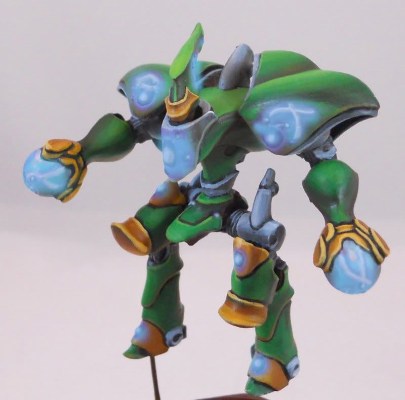
Blue for the more subdued route. I though about blue initially but I wanted more contrast. Although now that I can see it I definitely think it could work
Actually my favorite. A ton of contrast but none of the pastel look. The biggest problem here is that I don't know if I can achieve this look with actual paint.


 Reply With Quote