Page 1 of 2 12 LastLast
Results 1 to 10 of 19

Thread: Too Pretty?

Hybrid View

Previous Post Previous Post   Next Post Next Post
  1. #1
    Senior Member
    Join Date
    Oct 2010
    Location
    Austin
    Posts
    357

    Too Pretty?


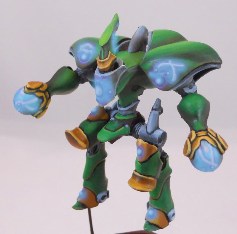
    I know elfy things are supposed to be pretty, but I'm a little worried this alt paint scheme is a little too nancy.

    I guess the real question is... would you sport a whole army of these things at the LGS without worrying about anyone questioning your man cred? Or would that be irrelevant since you'd already be playing elves?

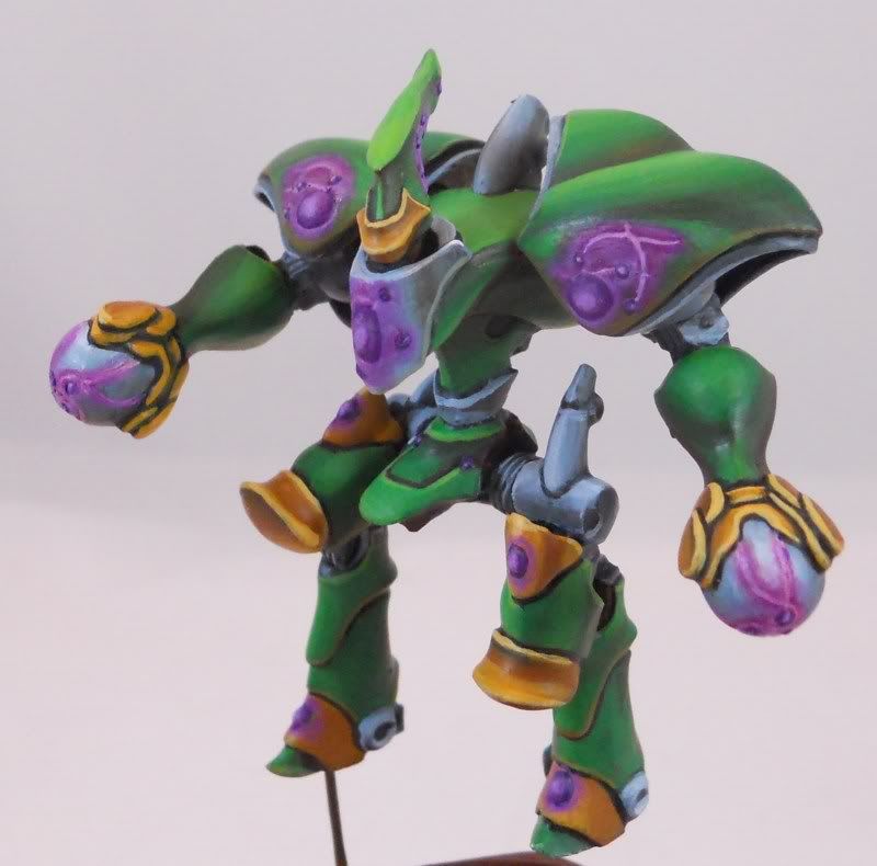
    Mostly its that purple that sets me off I think. But it took me awhile to get the glow to something that I liked and those grooves don't really have room in them for anymore paint. If I want to fix it I'm going to have to scrape that paint out.

    Also, no I'm not starting a ret army. This is for a miniature exchange/bols article.

  2. #2
    Senior Member Geist's Avatar
    Join Date
    Oct 2010
    Posts
    1,428
    its the green and purple. Together they are too pastel and not in a good way. The green is a really eye catching green and then the purple is a really light shining purple which makes the eye unable to focus as you have two colors both vying for the eyes attention. If anything I would go with a more royal purple and a less military shade of green maybe even wash the really bright spots in something like a mud or black.
    "The Machine will grind you down."
    Inventor of the "Chris Noble".

    Bayou 2011 "Hero to Zero"
    Lone Wolf 2011 9 3rd overall. "GateKeeper"
    2013 North Texas Battles 3rd overall and tied for 3rd best sport.

    "He's a judicious calculating master tactitician who will exploit the slightest weakness in anyone's plan and known for building intricate masterful lists that are incredibly hard to destroy and making people pay dearly for tactical mistakes. "

  3. #3
    Senior Member
    Join Date
    Oct 2010
    Posts
    1,064
    I think either one of these colors would look great.. but not next to each other. If they were against a solid white or black i think they would look great but together.. *barf*

  4. #4
    Senior Member
    Join Date
    Sep 2010
    Posts
    509
    Not feeling this at all.
    Last edited by Mustakrakish; 04-02-2012 at 10:04 PM. Reason: edited for douchebaggery

  5. #5
    Senior Member cody's Avatar
    Join Date
    May 2011
    Location
    Austin
    Posts
    600
    Don't listen to the haters. If someone's worried about being sufficiently manly while playing with their toy soldiers...

  6. #6
    Senior Member evilamericorp's Avatar
    Join Date
    Sep 2010
    Location
    Austin
    Posts
    862
    I like the paint scheme all right, but that model is hideous. It's like 2nd ed 40k stuff in the worst kind of way...
    Give a man fire, and you keep him warm for a night.
    Set a man on fire, and you keep him warm for the rest of his life.

  7. #7
    Senior Member m3g4tr0n's Avatar
    Join Date
    Feb 2011
    Location
    Cedar Park, TX
    Posts
    1,095
    Aside from the obvious anti-elf jokes, you'd need to be pretty manly to pull off a color scheme like that. At the very least, you'd need to wear a lot of flannel and have a rather large, bushy beard.
    My painting blog.
    Want a pick-up game? Text me: 512-981-5340

  8. #8
    Senior Member RealGenius's Avatar
    Join Date
    Sep 2010
    Location
    Not Austin
    Posts
    4,907
    I'd prefer a muted blue over the purple. The purple is too contrasty.
    Jim
    This is why you don't go to Jim's. --Minus67
    Rook End | The Fly Lords of Terra

  9. #9
    Senior Member
    Join Date
    Oct 2010
    Location
    Austin
    Posts
    357
    Alright. I have performed some photoshoppery.


    Less contrast. But it does look an awful lot like the gold areas.


    Blue for the more subdued route. I though about blue initially but I wanted more contrast. Although now that I can see it I definitely think it could work


    Actually my favorite. A ton of contrast but none of the pastel look. The biggest problem here is that I don't know if I can achieve this look with actual paint.

  10. #10
    Senior Member m3g4tr0n's Avatar
    Join Date
    Feb 2011
    Location
    Cedar Park, TX
    Posts
    1,095
    I like the red.
    My painting blog.
    Want a pick-up game? Text me: 512-981-5340

Posting Permissions

  • You may not post new threads
  • You may not post replies
  • You may not post attachments
  • You may not edit your posts
  •